
What Is Every Element in Your Photograph Doing?
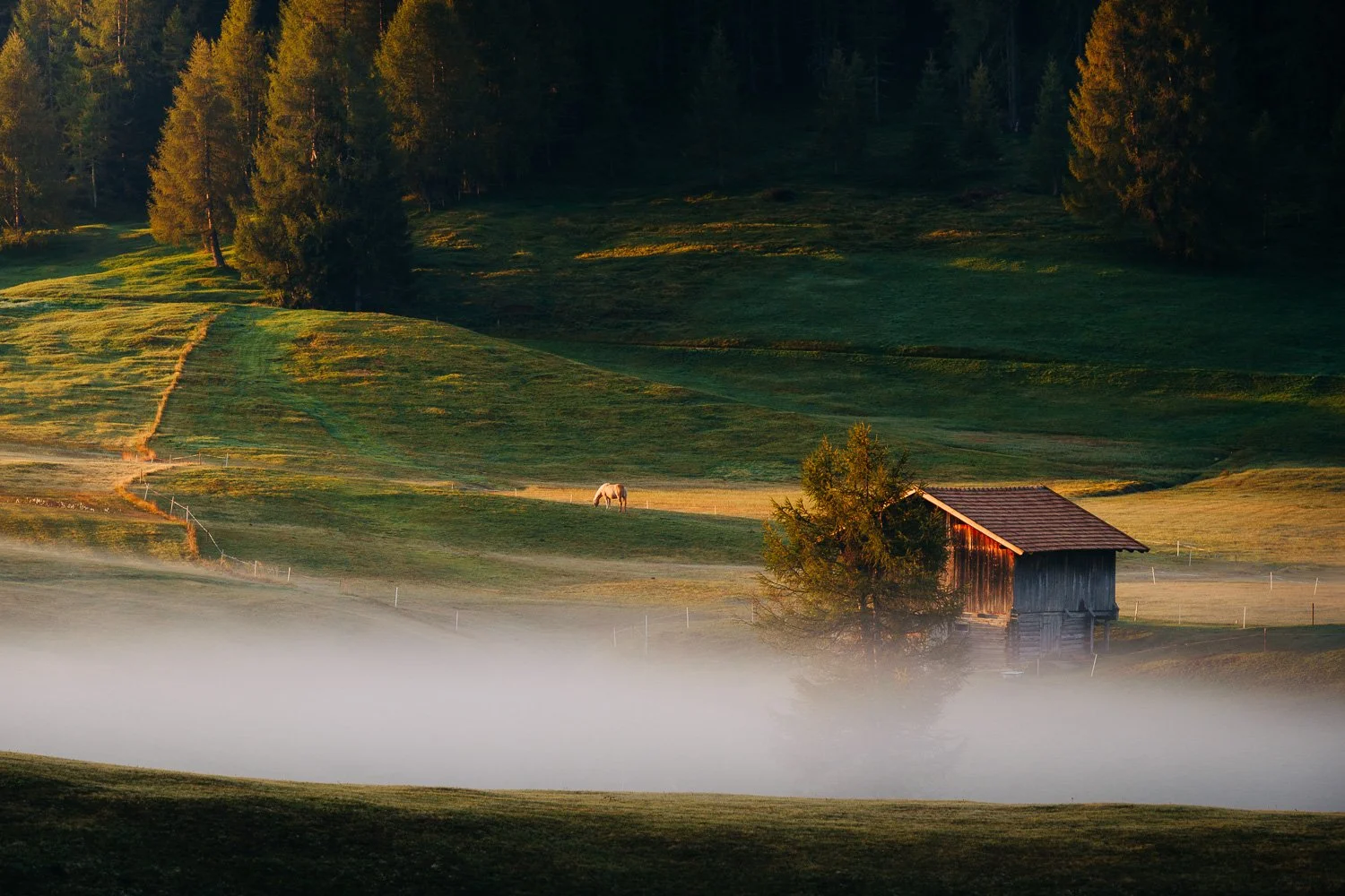
I was watching an interview with Joe Satriani when he said something that brought my two creative lives together in one sentence:
“It’s not really right or wrong. It’s cause and effect.”
He was talking about notes. His point was that a musician needs to understand what a note does in relation to everything around it, not simply know where to find it on the instrument.
Joe Satriani is one of my biggest influences as a guitarist. Before photography became my profession, I spent nearly two decades working as a guitarist and guitar instructor. So, when I heard Satriani explain this, I didn’t think only about music. I thought about a question photographers often ask me during workshops:
Is this composition right?
The camera can tell us if the image is in focus. The histogram can warn us about the exposure. We can learn which aperture will give us the depth of field we need and which shutter speed will hold detail in moving grass or blowing sand.
None of those things can tell us why an element belongs in the frame.
Instead of asking whether a composition is right, I think a more useful approach is to understand what each element contributes—and what changes when we move, remove, enlarge, separate, or overlap it.
That is where landscape photography composition becomes less about rules and more about cause and effect. What changes because that element is there? What happens if we move it, make it smaller, separate it from something else, or remove it completely?
Technique can be impressive and still have no direction
Technical control helps us execute an idea. It cannot decide what that idea should be.
When I taught guitar, I met many young players with extraordinary physical ability. Some could play things I couldn’t have played at their age. In a few cases, they could play things I probably couldn’t play now.
It was impressive, but often it was closer to gymnastics than music. The speed was there. The difficult licks were there. What was missing was a reason for those notes to exist.
Learning another complicated phrase was usually easier than learning how to choose one meaningful note.
Vibrato and bending were always two of my bread-and-butter techniques. Both can add something close to the expression of the human voice, but there is no single correct way to use them. A bend can rise slowly or arrive with force. Vibrato can be subtle or exaggerated. What matters is what that choice does in that particular moment.
After many years, those decisions felt instinctive. But instinctive didn’t mean random. The instinct came from listening, practising, reacting, and learning what each variation did.
Photography works in much the same way. A poor shutter-speed decision can destroy a photograph in strong wind. A badly placed focus point can make the most important detail soft.
But it cannot supply the intention.
Composition Is Cause and Effect
An element does not have a fixed role. Its meaning changes according to everything around it.
A note changes according to the chord beneath it and the notes around it.
Its role comes from relationships.
The elements inside a photograph behave in a similar way. A tree has no fixed visual meaning. It can feel isolated or protected, dominant or insignificant. Place it against an empty field and it may become the entire story. Place it among several brighter, larger, or more detailed elements and it may almost disappear.
The same is true of a mountain, a person, a road, or an area of light. Their effect depends on visual weight, scale, position, separation, overlap, colour, contrast, and the amount of space around them.
This is why compositional rules can only take us so far. They may suggest where to place something, but they cannot decide what that element is doing there.
What matters is the visual cause and effect. If I move this element, what changes? If I make it larger, what becomes less important? If I include more space, does the photograph become calmer, emptier, or simply less focused?
There is rarely one universally correct answer. There are consequences.
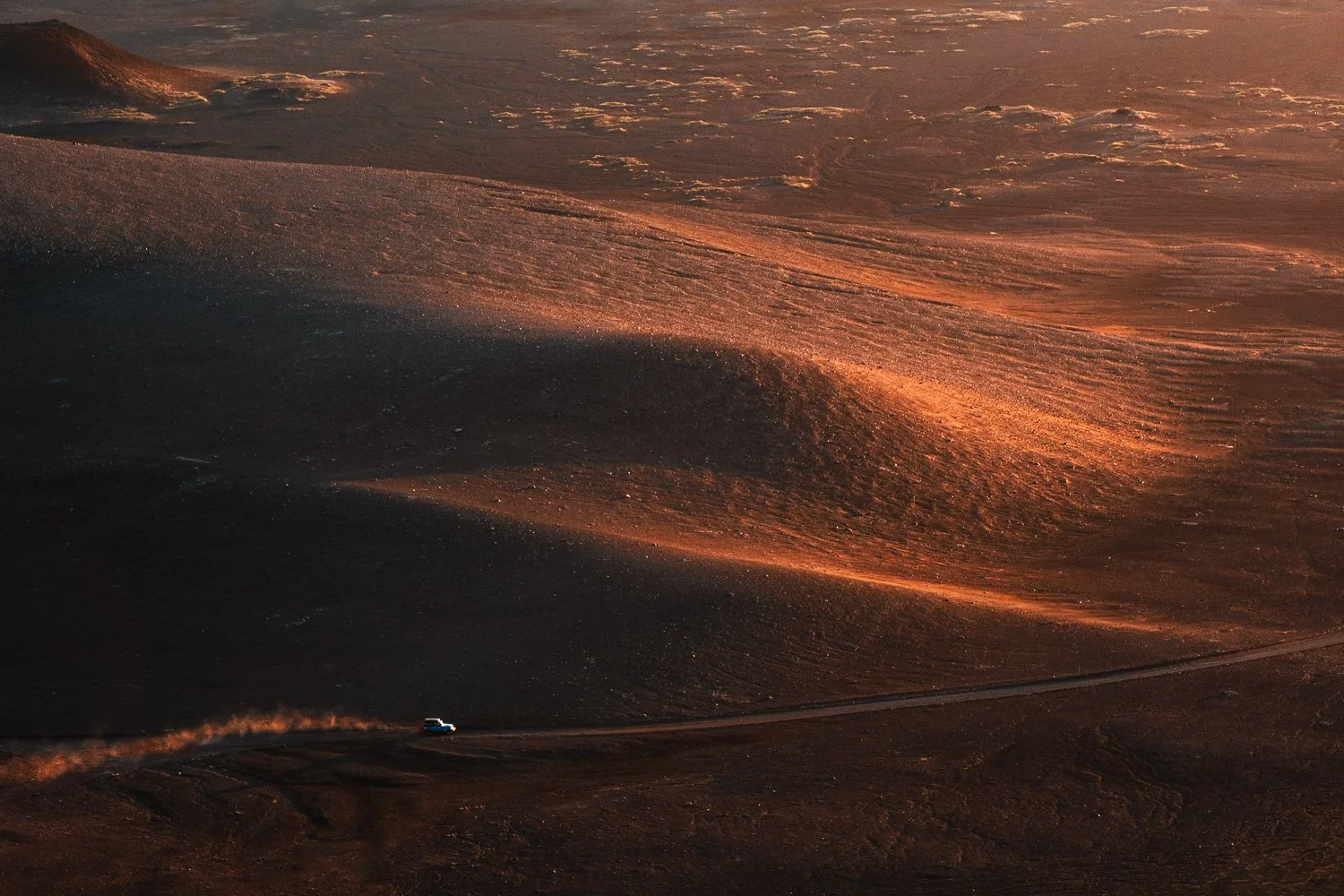
The vehicle occupies only a tiny part of the frame, yet its brightness, position and isolation give it considerable visual weight. Make it larger, move it, or remove it, and the relationship with the enormous landscape changes completely.
The visual equivalent of a nervous twitch
A useful technique becomes a limitation when it appears automatically, before we have decided what the photograph needs.
In the interview, Satriani recalls a lesson with jazz pianist Lennie Tristano. Tristano disliked the automatic vibrato he heard from many guitar and saxophone players. He challenged Satriani to play a simple G note and make it sound good without automatically adding vibrato.
Satriani realised he had never really done that. Vibrato had become an automatic reaction rather than a choice made for the music in front of him.
Photographers have their own versions of that nervous twitch. We reach for the widest lens as soon as the landscape feels grand. We search for a foreground before deciding what the real subject is. We place something on a third, brighten every shadow, add contrast, or look for a leading line because those methods have worked before.
None of these choices is wrong. The problem begins when the technique arrives before the intention.
This happens easily in the landscape. Conditions are changing, the place can be overwhelming, and we want to capture what is happening before it disappears.
In that rush, we can miss the connection between what we see and what we want the photograph to say. We react to the beauty without identifying which part of it moved us.
The elements I removed from an Iceland sandstorm
Sometimes an element provides useful information about the place while weakening what the photograph is actually about.
During my 2026 workshop in the Icelandic Highlands, we encountered several sandstorms. In one case, I photographed the storm from far away. Sand moved across the landscape in large, translucent layers, partially revealing the smooth curves of the volcanic mountains behind it.
My first framing included part of a lake at the bottom and an area of sky and clouds above. Those elements provided context. They explained more about the place and gave the mountains an environment.
But they also changed the photograph in ways I didn’t want.
The lake introduced a different color and a cleaner, more reflective surface. The sky opened the frame and brought another layer of information. Structurally, both areas pulled the photograph away from the contained relationship between the sand and the mountains.
What had attracted me was much narrower. I wanted everything to feel sandy: the colour palette, the atmosphere, and even the surface of the air. I wanted the landscape to feel dry, desolate, and slightly otherworldly.
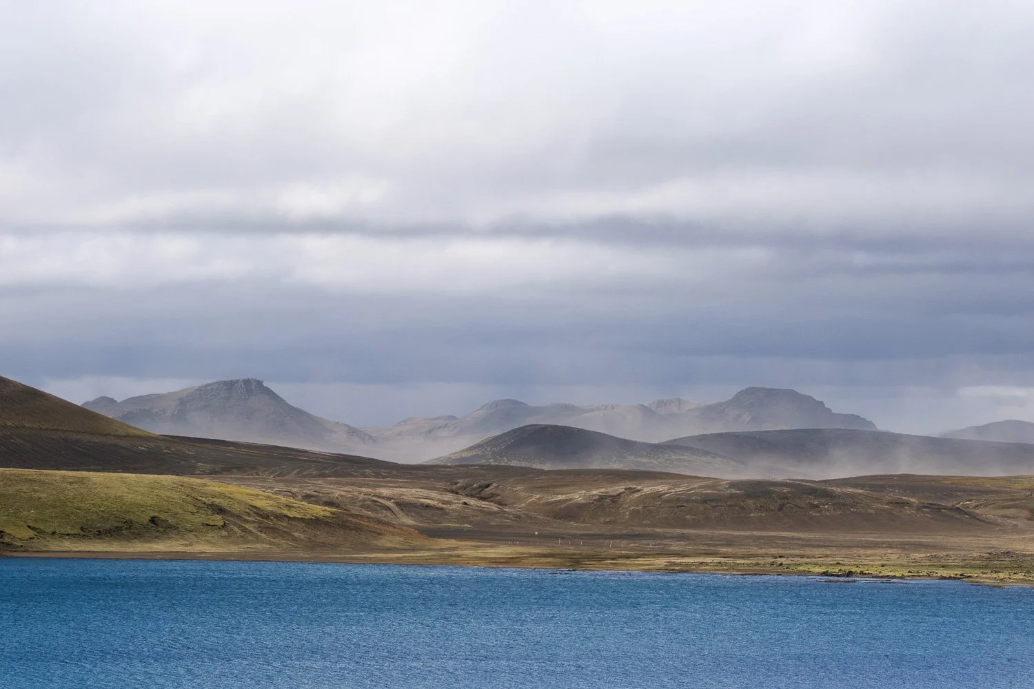
My first, wider interpretation included the lake, more foreground and a large area of sky. All of those elements added context, but they also introduced colour, space and information that competed with what had originally caught my attention.
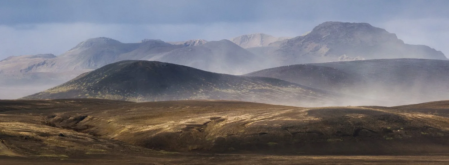
The final composition. By removing the lake and sky, the frame becomes almost entirely about the relationship between the volcanic mountains and the sand moving through them. The location is described less completely, but the experience I wanted to communicate becomes much clearer.
There was nothing inherently wrong with those elements. They simply produced the wrong effect for this photograph. They described the location more completely while communicating my experience of it less accurately.
The crop did more than simplify the composition. It brought the visual facts of the photograph closer to what I had felt while watching the storm.
Training the eye as a musician trains the ear
Instead of memorizing another compositional solution, practice recognizing what one decision changes.
Satriani describes ear training as more than recognizing the name of an interval. A musician hears the distance between two notes, notices its emotional effect, forms an opinion about it, remembers that response, and eventually uses it with purpose.
Photographers can practise visual relationships in the same way.
The next time you find a composition, make the first frame instinctively. Then change only one important relationship. Move until two elements separate. Allow them to overlap. Remove the sky. Include more empty space. Make the main subject smaller, or place it closer to the edge.
Now compare the results without immediately asking which one is better. Ask what changed.

In the wider frame, the cliff on the left, the sea stack, the birds, the ocean and the sky all have substantial roles. Rather than deciding immediately whether this is better or worse, the useful question is what each of those relationships makes us notice.

Moving to a much tighter composition changes the role of the sea stack completely. Context is reduced, its scale increases, and the relationship between rock, ocean and birds becomes much more dominant. Same subject, very different visual effect.
Where does your eye land first in each version? Does the frame feel more contained or expansive? Does one version describe the location while another communicates the experience more clearly?
Give the effect a name, even if the description is imperfect. That step matters. You are building a visual memory you can use again rather than collecting another formula.
Try this the next time you're photographing:
Make the composition that first feels natural.
Change only one important relationship.
Compare the two frames.
Don't immediately ask which one is better. Ask: What changed?
Repetition here isn't about making the same photograph again. It's about making a decision, observing its consequence, adjusting, and trying again.
This is closely connected to what I called the part of photography you shouldn’t make easier: the slow work of building visual judgement.
If you want a more structured way to begin this process, my free four-step composition guide starts with finding the element that matters and deciding what deserves to remain around it.
The question behind “Is this composition right?”
A yes-or-no answer may judge the frame. A better question helps the photographer understand it.
When a photographer asks me that question in the field, I prefer to work through the image together rather than answer yes or no.
First, I ask what made them stop. What was the key element that created the initial reaction? Once we identify it, we look at everything else in the frame and ask how it supports that element.

Working through a composition in the field is less about giving someone the answer and more about understanding what attracted them to the scene, what they want to emphasize, and what the other elements are doing around it.
Then the conversation becomes more precise. What feeling are they trying to convey? Do the colours, light, balance, textures, and level of complexity support it? Is anything near the edge pulling attention away? During editing, are light and contrast guiding the eye consistently, or have the adjustments created several competing areas of attention?
The aim is not to turn their photograph into my version of the scene. It is to help them translate their own response more clearly.
We Can Guide Attention, but We Cannot Control the Viewer
Cause and effect still matter, but a photograph is not a machine that produces one guaranteed emotional response.
Satriani speaks about knowing how notes will affect an audience. Photography needs one important qualification: we cannot decide exactly what another person will feel.
Every viewer arrives with different memories, preferences, and experiences. A remote landscape may give one person a sense of freedom and make someone else feel uneasy.
We cannot dictate that response. What we can influence is the visual direction of the photograph: where attention goes first, what competes for it, how much context we provide, and how clearly our choices translate our own response to the place.
Being moved by a place does not automatically produce a moving photograph. We still have to translate that response into visual choices.
When there is nothing left to remove
Simplification is not about making every photograph minimal. It is about understanding what the elements that remain are contributing.
Simplification completely changed how I approach landscape photography. I now tend to work in a removing mode rather than an adding mode.
Most of us know the phrase “less is more.” Yngwie Malmsteen has always preferred the opposite: “More is more.” In my photography, however, less is more. Removing an element often produces a clearer result than adding another one.
That doesn’t mean every photograph needs to be minimal. A complex frame can work beautifully, just as a dense musical arrangement can. But every important part should have a role. Complexity becomes confusion when the elements stop supporting one another.
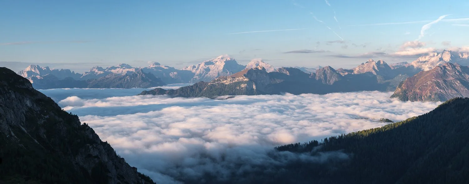
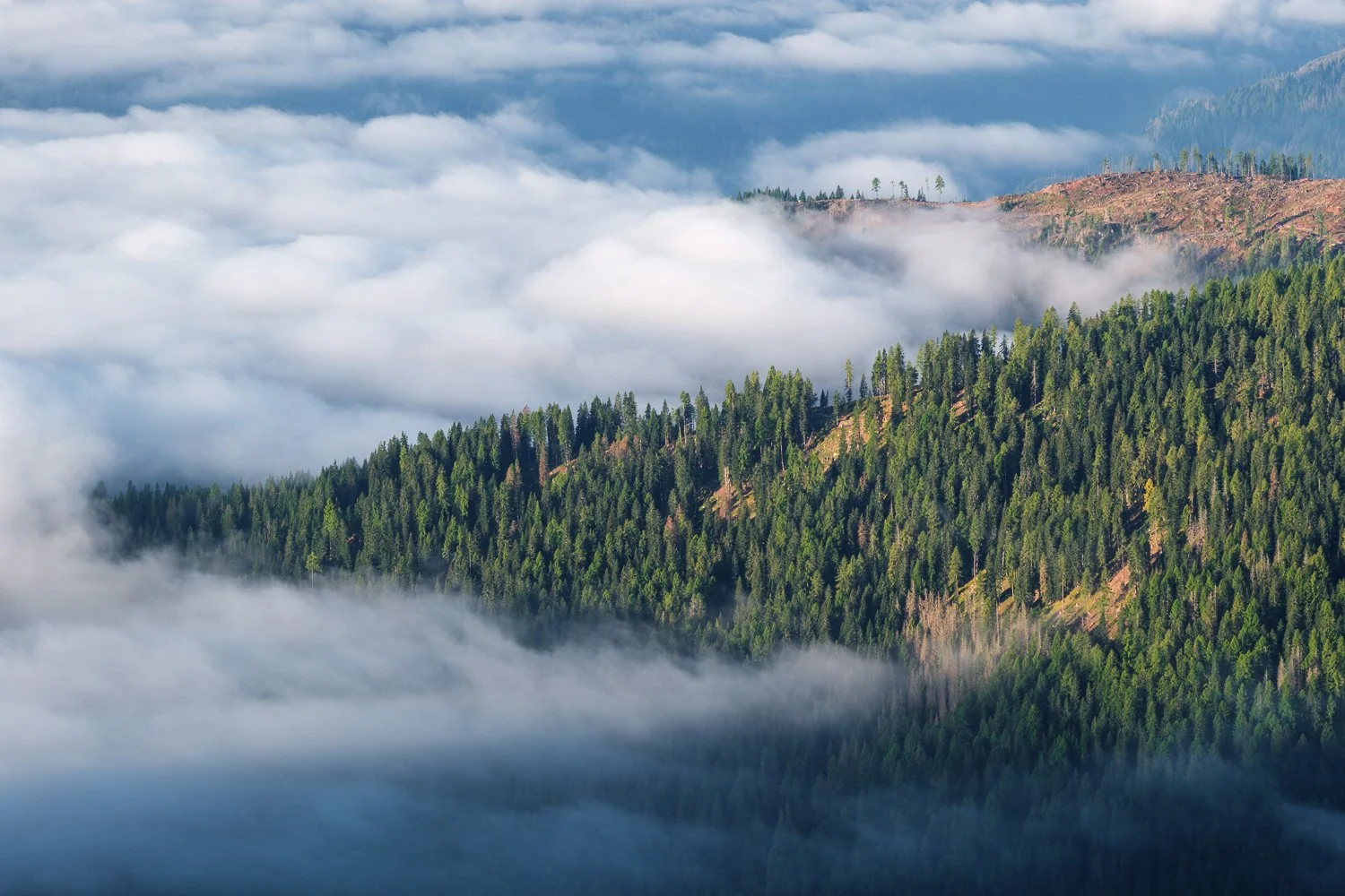
The wide scene contains far more information, while the tighter composition isolates the relationship that interested me most: the forested ridge, light and clouds. Removing information didn't automatically make the photograph better—it made the intention more specific.
For the way I photograph, I know I am getting close to the final composition when removing anything else would weaken the relationship I am trying to show.
At that point, the photograph has usually become clearer because the idea behind it has become clearer to me.
Technical knowledge makes that translation possible. Visual knowledge tells me what to translate. Instinct is what develops when those decisions have been examined and practised so many times that they begin to happen without a long internal conversation.
Over time, those accumulated choices become part of the way we see.
Eventually, the question changes. You stop asking whether the composition is right and begin asking something more useful:
What is every element in this photograph doing—and is that what I want it to do?
If you'd like to work through these decisions with me in the field, you can explore my upcoming small-group photography workshops here.

How to create visual balance in your landscape photos learning how to arrange attractions and distractions when composing a shot.